UI Selection#
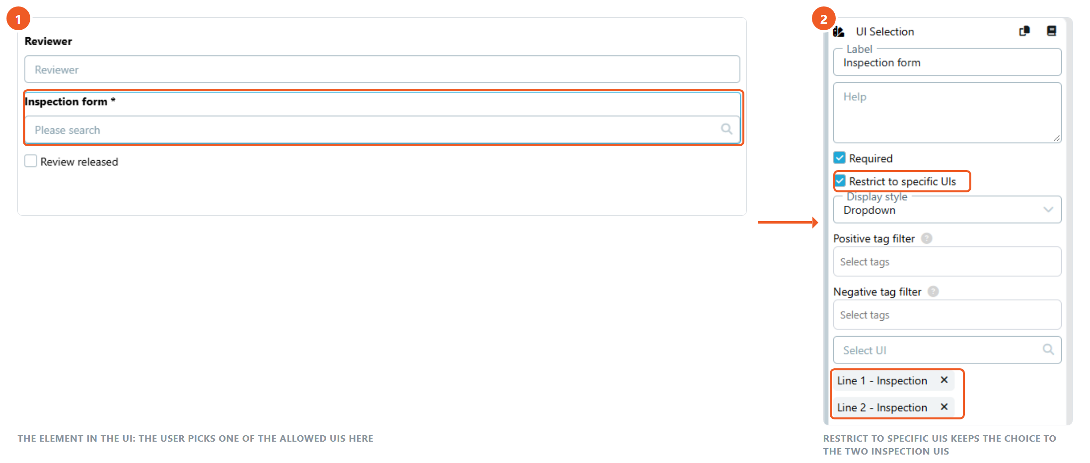
The UI Selection element allows users to select a UI. This is useful when the user should choose which UI is used in a subsequent step of a flow.
The choice belongs to the run it was made in. To store it on a Business Object instead, so that every Flow reading that object renders the same UI, use the UI Selection property of the Model Designer.
Settings#
- Required: If enabled, the user cannot complete the UI without selecting another UI.
- Restrict to specific UIs: Limits the available choices to selected UIs.
- Positive tag filter: Only shows UIs that have all selected tags.
- Negative tag filter: Hides UIs that have any selected tag.
- Display style: Controls how the selectable UIs are presented.
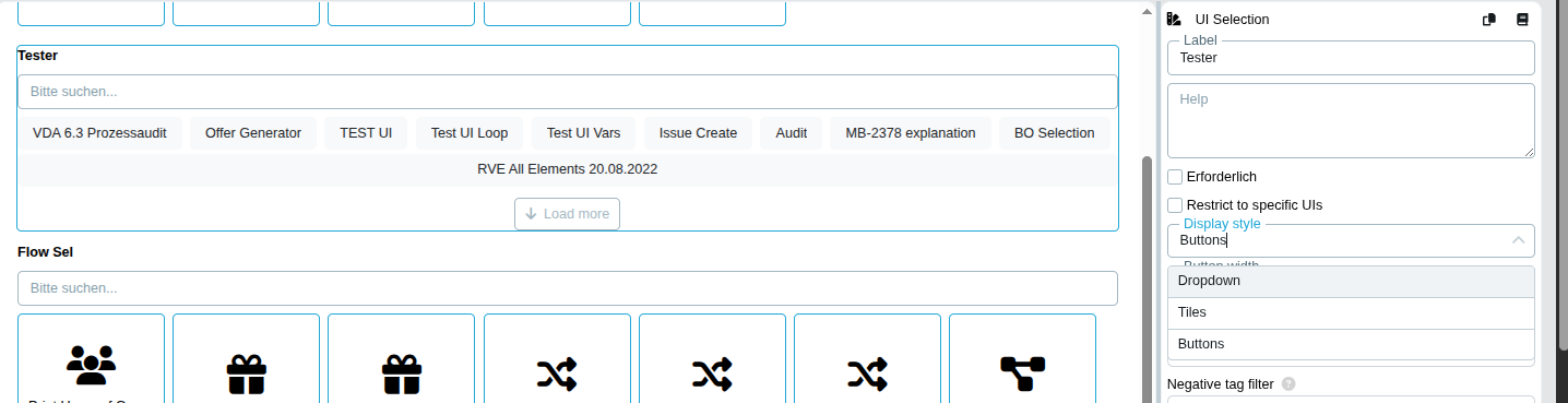
- Button width: Available when Display style is set to Buttons. Choose Adjust to label for dynamic button widths or Equal for equal-width buttons.
Display Style#
UI Selection supports the following display styles:
- Dropdown: Shows UIs in a searchable dropdown. This is the default display style.
- Tiles: Shows UIs as selectable tiles with the UI icon and title.
- Buttons: Shows UIs as selectable buttons with the UI icon and title.
Tiles and Buttons load the first 10 UIs automatically. Use Load more to append another set of UIs. The search field filters the available UIs. Clicking the currently selected tile or button clears the selection again, which allows a default value to be removed by the user.
Buttons in the UI Designer#
Buttons during UI execution#

Flow Variables#
The element provides two variables to the nodes that follow it in the Flow:
- Element label + (UI ID): the ID of the selected UI. Use it in a UI node switched to variable mode to render the selected UI later in the same run.
- Element label + (UI Label): the title of the selected UI, for texts, documents and conditions.
To keep the choice on a Business Object instead of inside a single run, store it in a UI Selection property. Every Flow that reads the object can then render the UI configured there.
See UI Designer