Grid#
The Grid element captures structured tabular input. You lay out the columns and rows up front, and each column decides what kind of value its cells accept — text, a number, a date or time, or a checkbox. At runtime the user fills in the cells of the resulting table.
It is a good fit for matrix-style data such as measurement tables, checklists with several attributes per item, or any input that is naturally organized into rows and columns.
Introduced in release 2026.11.
Example#
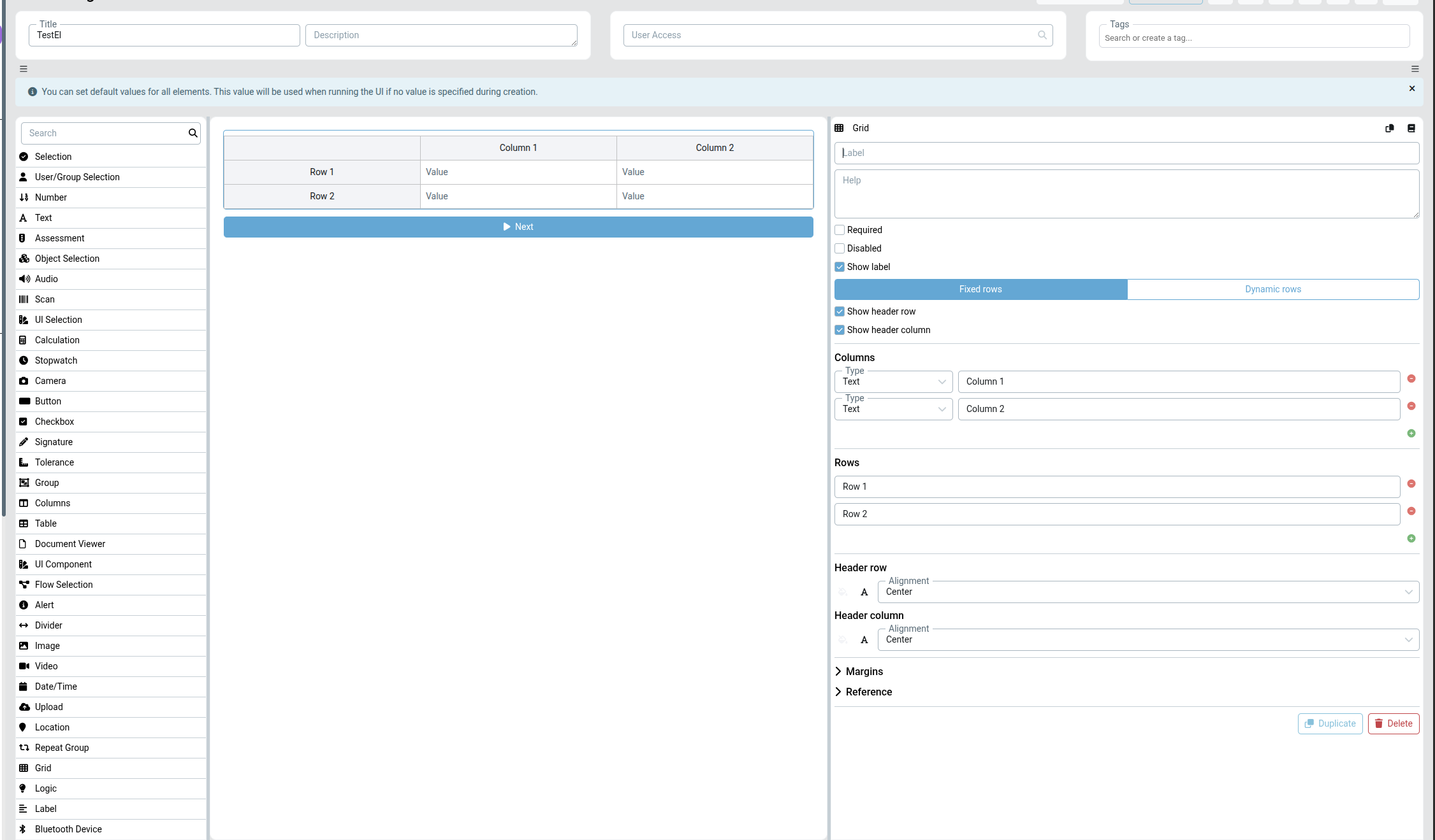
The grid above has two text columns (Column 1, Column 2) and two fixed rows (Row 1, Row 2). Both the header row and the header column are enabled, so the column titles run across the top and the row titles down the left, while every body cell shows a Value input.
Columns#
Each column defines:
- Type — the input type used for every cell in that column:
Text,Number,Date,Time,Date-Time, orCheckbox. - Label — the column title shown in the header row.
Add a column with the green + button and remove one with the red – button beside it.
Rows#
How rows behave depends on the row mode:
- Fixed rows — you predefine the rows in the element settings. Each row has a label shown in the header column, and the same set of rows appears every time the UI runs. Add or remove rows with the + / – buttons.
- Dynamic rows — rows are not predefined. The user adds (and removes) rows themselves while filling in the form, which is useful when the number of entries is not known in advance.
Header row and header column#
- Show header row — displays the top row carrying the column labels.
- Show header column — displays the left column carrying the row labels.
Each header has its own alignment (for example Center) and text-styling controls, so the headers can be visually distinguished from the body cells.
Settings#
| Setting | Description |
|---|---|
| Label | The element label shown above the grid. |
| Help | Optional helper text describing the element. |
| Required | If checked, the element must be filled in before the form can be submitted. |
| Disabled | If checked, the grid is read-only and cannot be edited at runtime. |
| Show label | If checked, the element label is displayed. |
| Fixed rows / Dynamic rows | Chooses whether rows are predefined or added by the user at runtime. |
| Show header row | Shows the top header row with the column labels. |
| Show header column | Shows the left header column with the row labels. |
| Columns | The list of columns, each with a cell Type and a label. |
| Rows | The list of (fixed) row labels. |
| Header row / Header column | Alignment and text styling for each header. |
| Margins | Spacing around the element. See Margins. |
| Reference | A unique reference for addressing the element from the Flow Designer. See Reference. |
Notes#
- Cell input types are set per column, so an entire column collects the same kind of value.
- Use Fixed rows for known, labelled rows (for example a measurement matrix or a fixed checklist) and Dynamic rows when the user decides how many entries to add.
See also UI Designer