 Creator
Table#
The Table element displays tabular data in the generated document. The table content (column titles and row data) is populated dynamically from the Flow Designer using the Table Generation node.
Settings#
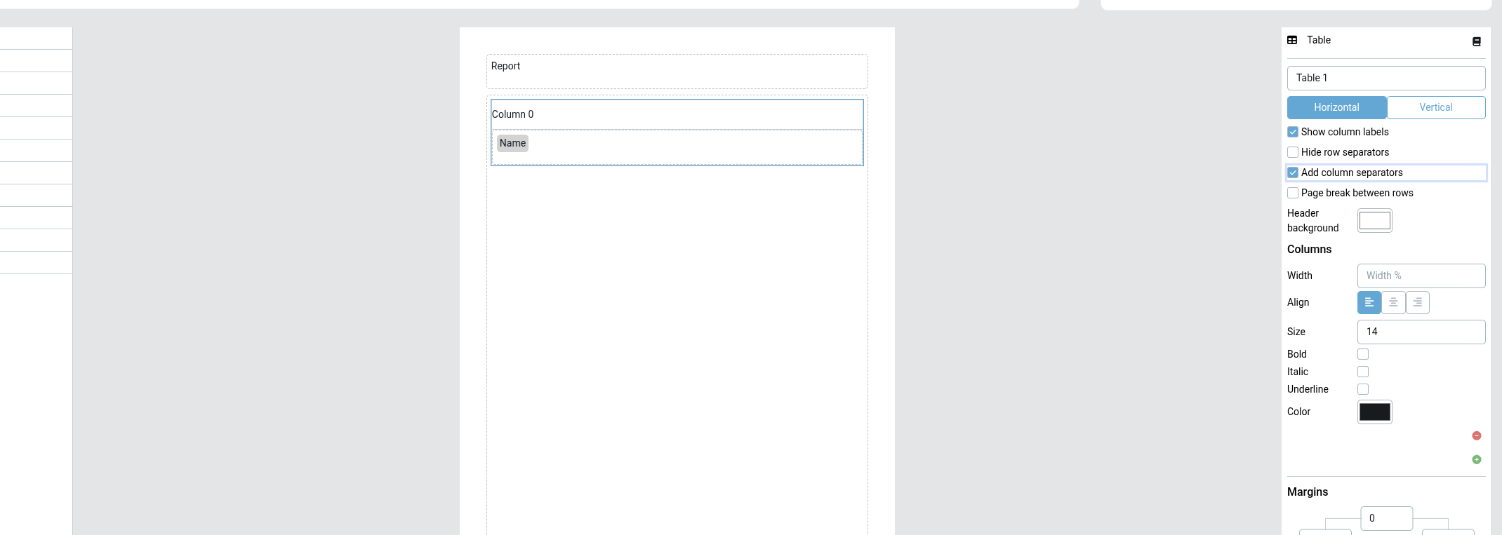
- Orientation: Table layout direction — Horizontal (standard) or Vertical (headers on left)
- Show header: Show or hide the column header row
- Hide row separators: Remove horizontal lines between rows for a cleaner look
- Add column separators: Draw vertical lines between columns, plus an outline around the table — the counterpart to the row separators, useful for dense tables where the column and table boundaries should stand out
- Page break between rows: Insert a page break between rows (useful for long per-row content)
- Row height: Height of each row in pixels
- Header background color: Background color for the header row
- Columns: Define one or more columns. Each column has:
- Width
- Alignment (left, center, right)
- Header font settings (size, bold, italic, underline, color)
When Add column separators is enabled, vertical dividers are rendered between the table columns and a border is drawn around the outside of the table (top, left, right, and bottom edges) — consistently in the editor preview, in Flow report rendering, and in generated DOCX/PDF documents, for both Horizontal and Vertical orientation.
How it works#
- Add a Table element to your template in the Template Designer
- In the Flow Designer, use a Table Generation node to define the column headers and map data to each column
- Use a Table Loop node to iterate over Business Objects or other data sources and populate the table rows
Tips#
Tables can contain other template elements in their cells, including Document elements for embedding sub-documents per row.